With our dataset in place, we’ll take a quick look at the visualizations you can easily create from a dataset using popular Python libraries, then walk through an example of a visualization.
Introduction
This article is part of the Data Cleaning with Python and Pandas series. It’s aimed at getting developers up and running quickly with data science tools and techniques.
If you’d like to check out the other articles in the series, you can find them here:
Now that we’re at the point where our data seems to be clean, and we have a couple different potential views of it, we can explore our visualization options. Visualization is the last important step in the data cleaning process as it provides a good way to ensure the dataset makes sense.
Note that we've created a complete Jupyter Notebook with the source data files for this series of modules, which you can download and install locally.
Comparing Visualization Libraries in Python
There are many Python libraries for visualizing datasets. Popular ones include Matplotlib, Seaborn, ggplt, and Plotly. Pandas, the library we're currently using, also has its own visualization features.
So, how do you choose and what do you need? Well, it depends greatly on your requirements, and how comfortable you are with visualizations and Python.
- Matplotlib might be the most widely used library as it was one of the first visualization libraries and it’s very powerful. However, it's complex and its age is noticeable in the way visualizations are presented.
- ggplot is a plotting system ported from the R programming language used for statistics and data mining. ggplot makes creating visualizations much simpler compared to Matplotlib and is very good at layered graphs.
- Plotly excels in creating dynamic and interactive visualizations, much like the online platform of the same name.
- Seaborn is built on top of Matplotlib and harnesses the power of that library while simplifying the process of making charts. It also has a number of very pleasing default styles that make it easier for those starting with Python data science to create something nice.
In our case we will show off some of the Seaborn visualizations of our data set.
Seaborn Visualization Types
There are many styles you can choose when building visualizations on top of data sets. Sometimes, the simplest option provides the best results, but some visualizations suit different data sets..
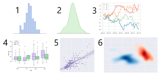
Here are examples of some of the more common visualizations:

- Bar Charts - The most common visualization of data is the bar chart. This chart is most useful when you want to have a comparison view of different data elements. For instance, in a bar chart you can very easily see the biggest value, smallest value or the difference between one or more values.
- Area Charts - Area charts look similar to bar charts but are more useful for showing increases and decreases in values.
- Line Charts - Line charts are normally used when representing a few observations that change over time for things like trend analysis, especially when those changes over time are small.
- Box Plot - Sometimes your data sets aren’t composed of simple values. A box plot allows you to visualize data that consists of a five-number summary: minimum; first quartile; median; second quartile; maximum.
- Scatter Plot - Scatter plots, with values usually represented as points, are useful for visualizing the distribution of values.
- Kernel Density Plot - Finally, if you need to visualize the probability densities, a Kernel Density Plot works pretty well.
These are just a few of the more popular visualizations Seaborn can create. The documentation site of Seaborn also has a large library of examples. We are going to look at two different visualizations with our data set, a bar chart and a line chart.
While these two visualizations are only a small part of what Seaborn contains, the important part is to understand the Seaborn API and observe how easily it pulls data directly from Pandas DataFrame. Once you understand how to use Seaborn for simple charts, you’ll be ready to dive in and use the library’s more advanced visualizations.
Creating a Seaborn Bar Chart
We’re going to be getting our data from Pandas DataFrames created in earlier articles in this series. If you’d like to see how these DataFrames were created, feel free to go back and read through the entire series. It’s a quick, fun read!
If you’re already familiar with Pandas DataFrames, however, reading the series won’t be necessary. You already know everything you need to understand the code samples below.
To show off a simple bar chart, let's look at a visualization of the total purchases by state DataFrame we created at the end of our reshaping data step. We have already imported and setup Seaborn with the following code at the start of our notebook:
import seaborn as sns
sns.set(style="darkgrid")
If we start a new code block and add the following:
plt.figure(figsize=(20,10))
stateTotalsChart = sns.barplot(data=totalsData, x='state',y='amount')
stateTotalsChart.set_xticklabels(stateTotalsChart.get_xticklabels(), rotation=45, horizontalalignment='right')
The resulting barplot looks like this:

This three line code does three things. Firstly, it makes the default chart a little bigger by setting the figsize. The second line creates the actual bar chart using barplot and sets the data to be the totals data, with state as the x axis and amount as the y axis. Finally the last line improves the x axis labels a little by rotating them. This makes the visualization look really good, and it took only three lines of code.
Creating a Seaborn Line Chart
To show off a line chart, we are going to create a new summary DataFrame with the data grouped by purchase date. Create a new code block and add the following:
purchasesByDay = combinedData.groupby(by='purch_date').sum().reset_index()
purchasesByDay.drop(columns=['purchase_id','customer_id','product_id'], inplace=True)
print(purchasesByDay.head(10))
This will create a new DataFrame in which the amount of goods sold, what was paid, and the retail cost are summarized for the day.

Now we can start another new code block and create our line chart:
plt.figure(figsize=(20,10))
dailyTotalsChart = sns.lineplot(data=purchasesByDay, x='purch_date',y='amount')
Here's the chart:

This time we only need two lines, the first to set the size of the chart and, because the x axis is a date sequence Seaborn summarizes the x-axis properly, the second creates the chart with purchase totals over time. This allowed us to very easily create a useful plot with very few lines of code.
Review
We’ve just scratched the surface of what Seaborn can do, because it would take an entire book to cover it in detail. The good news is that the API for Seaborn is very consistent; you can take what you’ve learned in creating simple line and bar charts, and use it with some of Seaborn’s more advanced visualizations.
Furthermore, Seaborn has great documentation. If you click on any of the examples in Seaborn’s large example gallery, you’ll see code that shows you how to create that visualization.
We looked at a number of different visualization libraries available to Python, as well as at a range of different visualization types. With only a few lines of code we’ve added some useful visualizations on top of our cleaned-up dataset. As our data changes, we can continue to run this notebook repreatedly to produce weekly, monthly, or even yearly updates to the visualizations of this data. We could even use this dataset in to train machine learning models.
Hi! I'm a Solution Architect, planning and designing systems based in Denver, Colorado. I also occasionally develop web applications and games, as well as write. My blog has articles, tutorials and general thoughts based on more than twenty years of misadventures in IT.


